Brand Identity · Editorial · Packaging · Visual Strategy
Designs that make
you say that's it.
Polish-born, LA-based graphic designer turning ambitious ideas into precise, unforgettable visuals. From bold logos to complete brand systems — if it needs to be seen, I'll make sure it's remembered.
One standard.
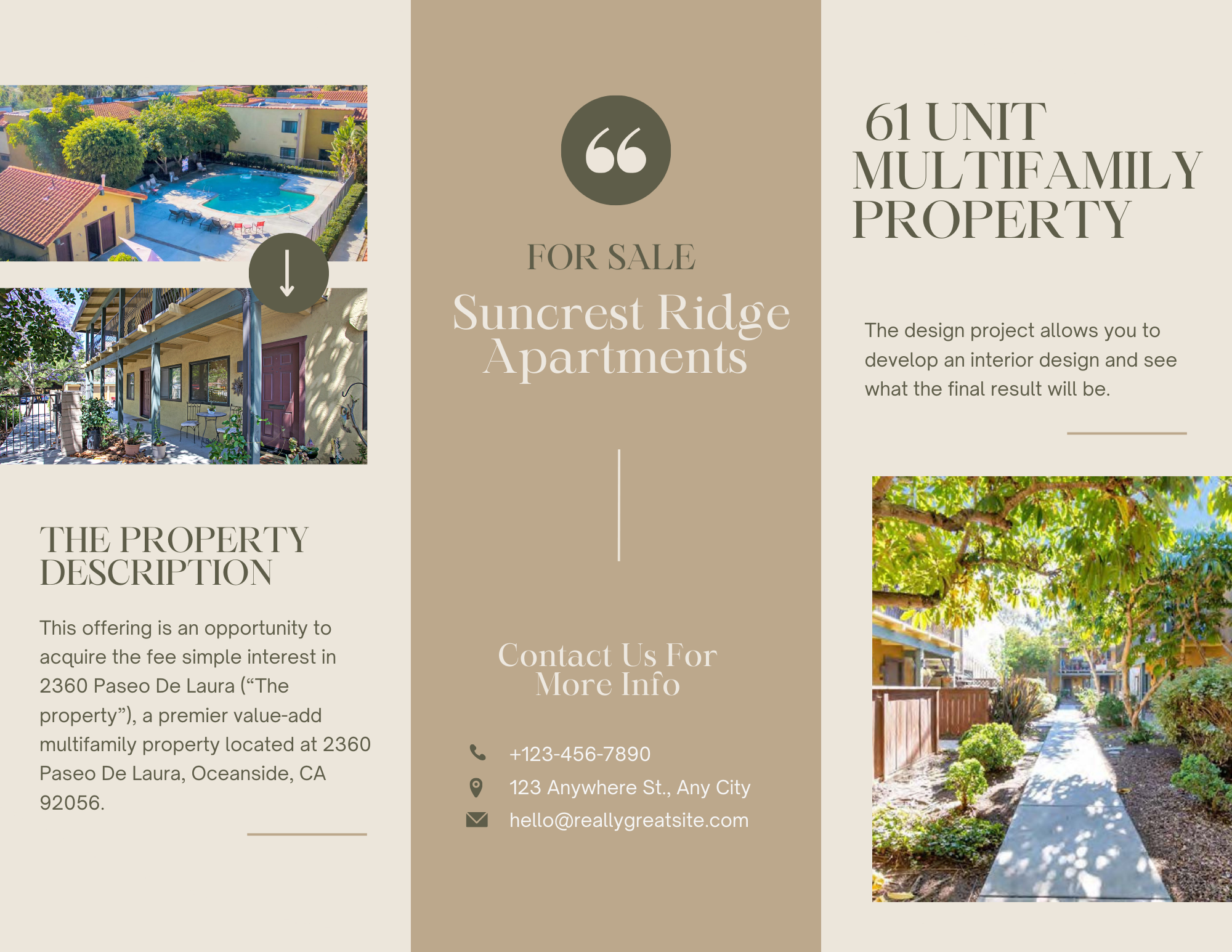
Whiskey & The Goat
Full brand identity for an upscale LA bar concept
Renegade Coffee & Bakery
Bold brand system for Melbourne's independent coffee scene
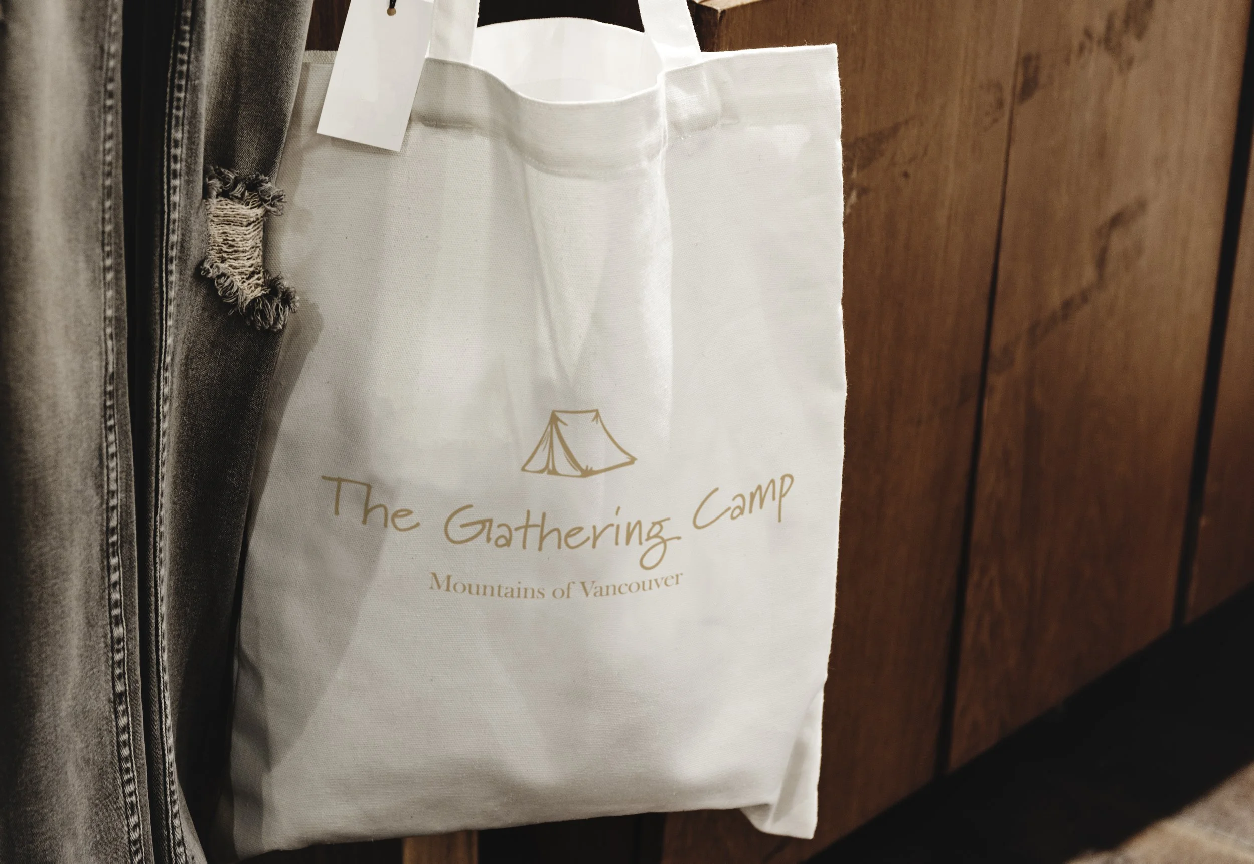
The Gathering Camp
Outdoor lifestyle brand built for the mountains of Vancouver
Brief → Final
Every project starts with a raw idea. Here's what it looks like when strategy meets design.
"We want a bar that feels like a converted warehouse — dark, warm, upscale but not pretentious. Think Arts District LA. We have a name and a concept, nothing else."
"We're opening in Melbourne. We want to feel independent, bold — a little rough around the edges but unmistakably quality. Something that stands out from every other third-wave coffee shop."
"We run outdoor retreat experiences in the mountains of Vancouver. Our community believes the best conversations happen around a campfire. We need merch that people actually want to wear — warm, adventurous, a little weathered."
Selected Work
Projects that speak
for themselves
Signage & Branding
Whiskey & The Goat
Full signage system and brand identity for an upscale LA bar.
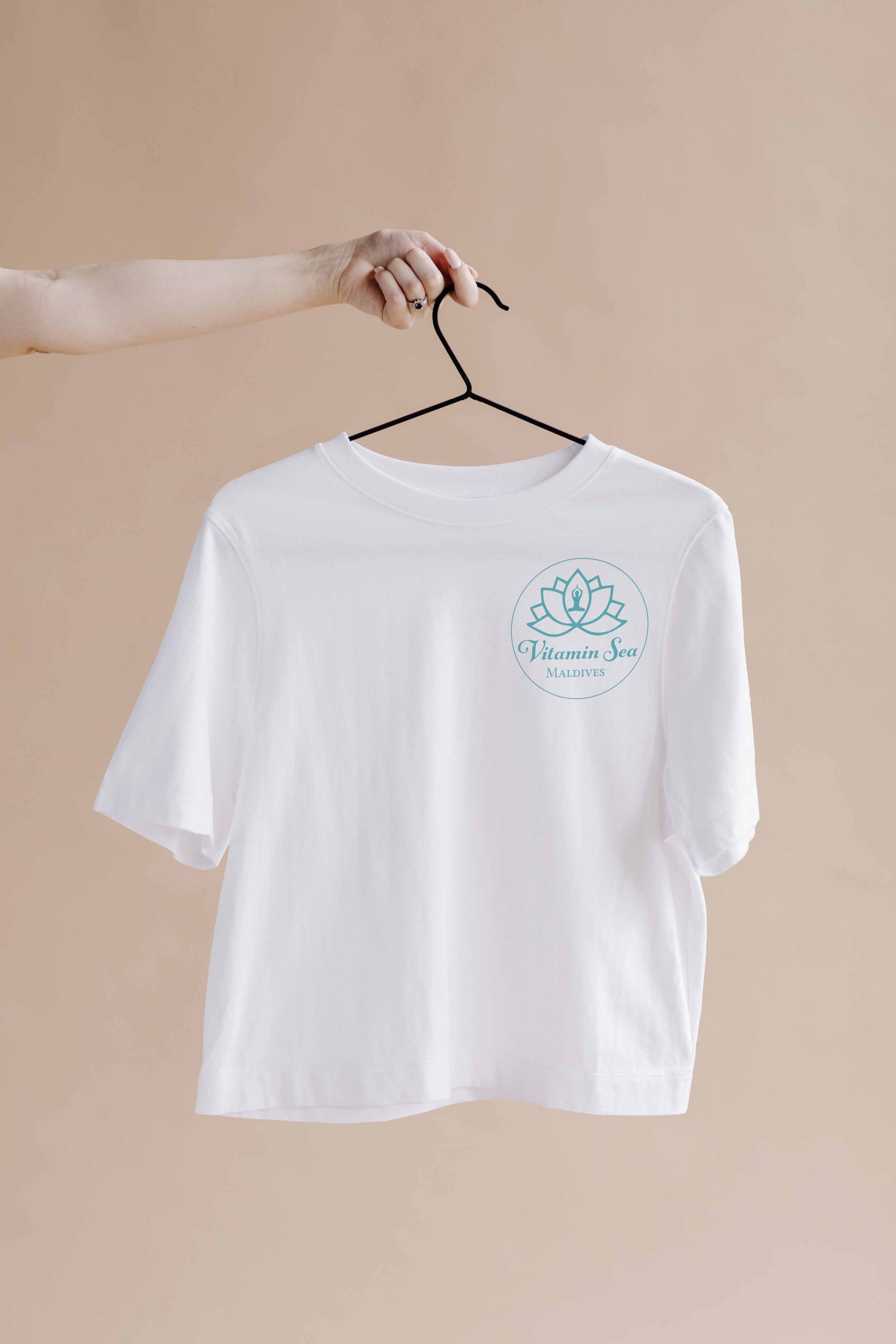
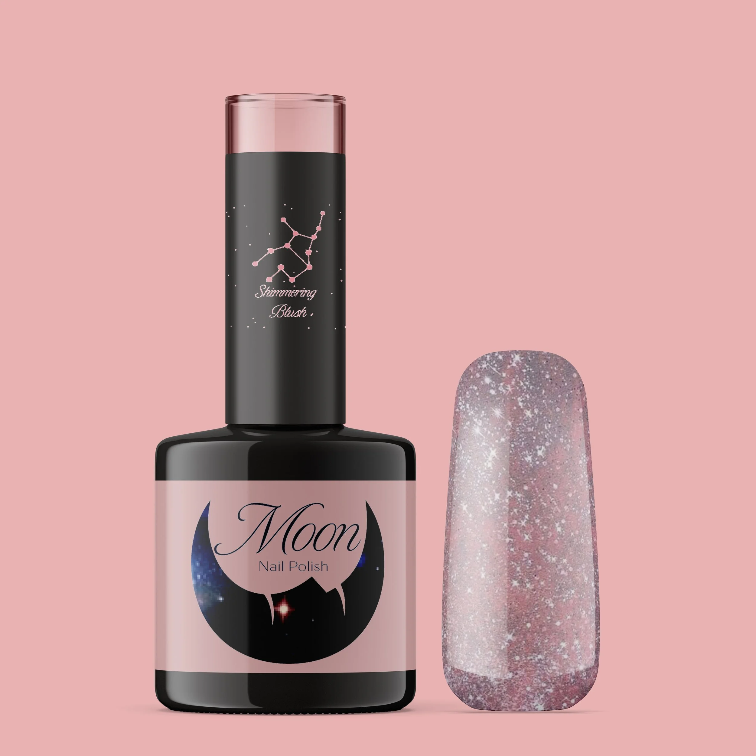
Packaging Design
Vitamin Sea
Bottle packaging for a wellness lifestyle brand.
Brand Identity
Renegade Coffee
Full brand identity for a Melbourne coffee shop.
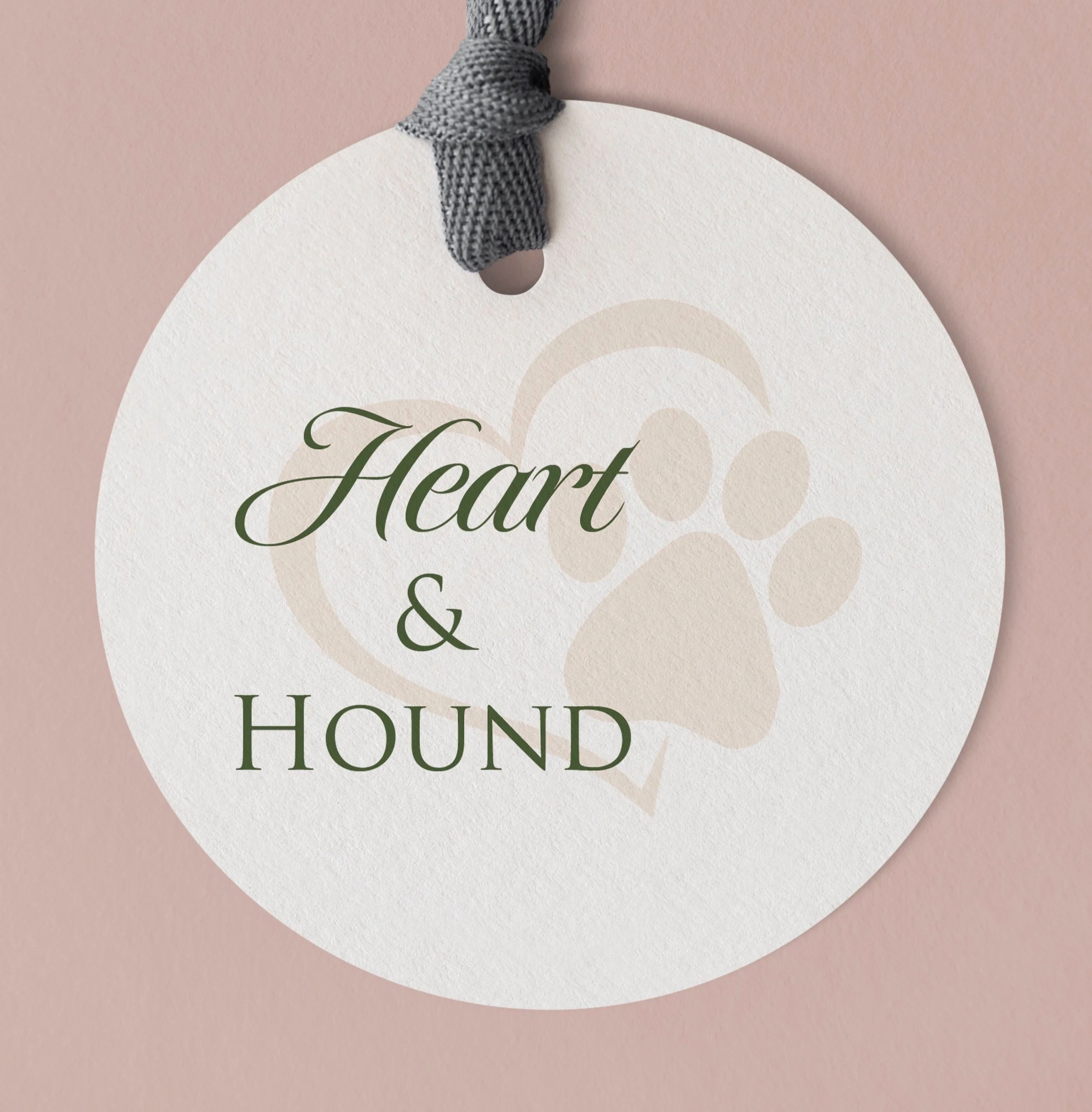
Merchandise Design
The Gathering Camp
Tote bag and merch for an outdoor lifestyle brand.
Digital / UI Design
Mobile App Concept
App interface and UX for a lifestyle product.
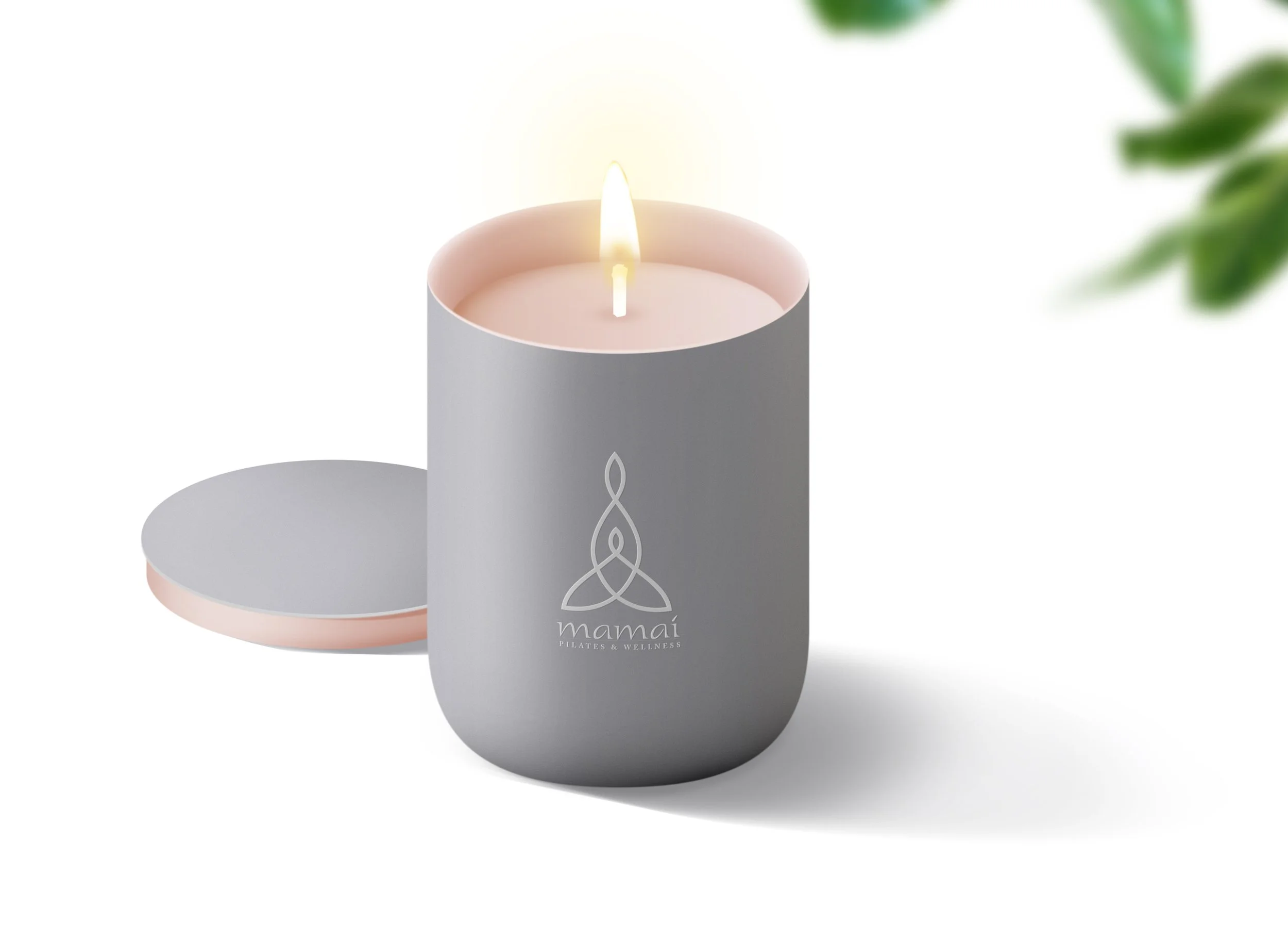
About Me
Poland meets LA.
Simplicity meets sophistication.
Hi, I'm Karolina — a graphic designer based in the sunny vibes of Los Angeles, originally from Poland. I grew up where design was taught as craft: meticulous, intentional, and purposeful. When I moved to LA, I layered that European discipline with bold, energetic West Coast spirit.
I specialize in turning ideas into eye-catching visuals — from logos to complete branding systems that leave a lasting impression. I build visual identities that help businesses communicate clearly, confidently, and memorably.
What I Offer
Transforming ideas into visual impact
01
Brand Identity
Complete visual identity systems — from strategy and naming to logos, color palettes, and brand guidelines that keep you consistent everywhere you show up.
02
Print & Editorial
From magazines and lookbooks to marketing collateral and signage — print materials that command attention and communicate credibility.
03
Packaging Design
Packaging that sells off the shelf and photographs beautifully online. Graphics and mockups for products that need to stand out in crowded markets.
How I Work
A process built on intention
01 — Discovery
Listen First
Before a single pixel is placed, I dig deep into your brand, audience, goals, and competitors. Understanding always comes before creating.
02 — Strategy
Define Direction
I establish the visual language — mood, tone, and reference points — so every design decision is rooted in a clear strategic foundation.
03 — Design
Craft & Refine
Iterative rounds of design with your feedback woven in. I present concepts that push and options that reassure — you choose the path forward.
04 — Deliver
Launch Ready
Clean file packages, print- and digital-ready assets, and full brand usage guidance. You walk away with everything you need.
Ready to work together?
Let's build something worth noticing.
Whether you're launching a new brand, refreshing an existing identity, or need a designer who shows up with craft and conviction — I'd love to hear from you.